I attended the StarEast conference in 1999 and there was a talk by James Bach titled "A Low Tech Testing Dashboard." This presentation clicked with me as I was managing several test teams at the time and it addressed a problem that I felt was important. I have used this communication tool many times ever since. If you are not familiar with it, I suggest you read through the PDF slides on the Satisfice web site before you continue. Go ahead. I'll wait.
In this review I will cover some of the who, what, where, when, how and why of the Low Tech Testing Dashboard (LTTD) through examples from past projects I have worked on. I expect your context is different, so my hope is that these examples may help you think about how you might apply this communication tool on your project.
Who are you? Whom is this for?
I have used this tool as a single tester on a development team, and as a team lead/manager managing multiple concurrent teams and projects - using one dashboard for each project.
The first time I used this dashboard, I was one of two testers working on a web application. We were both doing unscripted, risk-based Exploratory Testing and I needed a way to try and understand high-level testing progress since we had no other testing documents to use for reference. That is, it's hard to really understand what a tester means when they say they are "done" testing a feature and you have no way of really knowing if that means the same thing to both of you. Adopting the terminology and scales outlined in the LTTD presentation helped bring us together on the same page in describing progress.
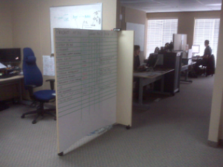
The primary audience for this information was our test team. We stood around the board daily and used it to identify priorities and plans for the day. The secondary audience was the development and project team. Our team was located next to the kitchen so the Testing Dashboard was in a highly-visible location. As soon as we identified our first "BLOCKED" item on the board, the dashboard became a tool for the development team to identify the immediate priorities to unblock our testing. We explained what 'Blocked' meant the first time it happened and then Dev automatically resolved these issues every time after that without additional prompting. Cool!
I have used this board in Waterfall-type projects with a lot of scripted tests and documentation, and on Agile projects too. It is helpful for daily Scrum (stand-up) meetings as it can help you remember what you worked on, what you plan to do, and it identifies any blocking issues or risks that we need help with.
What is the LTTD?
The name has two parts: (1) Low Tech, and (2) Testing Dashboard. They are both important. One describes how you communicate, and the other indicates what it is.
In Agile parlance, I have heard this dashboard referred to as an "information radiator." From the Agile Advice blog, "an information radiator is a large display of critical team information that is continuously updated and located in a spot where the team can see it constantly." One may argue that the entire Testing function/role/job purpose is to radiate (good) information. I agree with that perspective but will save that topic for discussion another day. Here I will focus on the outward presentation of particular information that communicates important project status and quality details to the project team.
The Testing Dashboard communicates different aspects or dimensions of the testing effort in a tabular format for everyone on the project team to see. The Low Tech part reminds you this information can and should be communicated using simple, readily available tools in a highly-visible area - such as a dry-erase board. You could make it high tech but you don't need to. In fact, in my experience, for a single co-located development team (i.e. where the whole team is in the same room), anything more high tech than a dry-erase board is likely a waste of time.
The Testing Dashboard is novel because it communicates (i) Test Effort, (ii) Test Coverage, (iii) Quality Assessment, and (iv) current risks for each Product Area under test, all in one convenient location. It represents a snapshot of these dimensions for a given moment in time or for a particular build. The use of smiley emoticons for the Quality Assessment is particularly effective. I have seen it happen several times where a developer will draw little devil horns on a red unhappy face. This is good because it shows their interest in interacting with the board and it is an expression of their feelings - in a humourous way. Fun interaction like this is always a good thing in my opinion.
Prior to using this dashboard, I was used to being asked for Test Coverage estimates (in terms of percentage tests complete and tests remaining) during Project Status Update meetings. This was likely a measure of the number of Test Plans, Test Cases, or Requirements covered using a Traceability Matrix of some kind. Those percentages always left me somewhat uneasy as I knew that precise measurements and estimates of such things don't reflect the reality of the remaining work to do.
What I like about the LTTD "Test Coverage" scale is that it was like going from Digital to Analog (i.e. a Physics/Electronics analogy). Suddenly I have this dial that I can use to more accurately describe the coverage! This is a good thing. In my opinion, precision in calculating remaining work to do is a waste of time. If humans are involved in the process, especially good testers, then your precise estimates will almost always be wrong. (NB: there is an important difference between accuracy and precision. It's great to have both but if I have to choose I'd rather be more accurate than precise.)
Where do you put the LTTD?

I've had mixed success with making the Dashboard high tech. At one company, I put a copy of the Testing Dashboard on the wiki. We used Atlassian Confluence at the time and it worked very well. Whenever we updated the dry-erase board during our regular morning stand-up meetings, I would take a few minutes to update the wiki version too. I started receiving comments from team leads in other departments thanking me for the information because they could now get testing updates without having to come up to our floor and see the board directly.
The nice thing about the wiki version was that we could create links to our test strategy pages, bug reports, and other helpful online information. It really does make a handy interactive Testing cover page or executive summary for each project!
This is a good time to mention another tester I know who has implemented a high tech version of the dashboard. Marlena Compton wrote about her experiences with the LTTD and posted it on her blog - see background and CAST 2010 presentation. I like what she's done with it.
Another time at a different company, I tried putting the Testing Dashboard on a wiki to help facilitate the communication for a test team that was distributed geographically. It didn't work very well. Okay, it didn't work at all. Unfortunately, the test team didn't use the wiki for testing purposes. I believe communication in general was a problem on this particular project, so the effort was probably doomed from the start. I haven't ruled out a wiki-based Testing Dashboard as a helpful tool for distributed teams, so I plan to try again when the opportunity presents itself.
When do you update the dashboard?
I create a fresh Testing Dashboard as soon as a project is kicked off. We add testing areas and features to the board as we hear about them and it is a good way to keep track of what is coming and when.
The original presentation suggests updates 2-5 times per week depending on your needs. That sounds about right. One time we were so involved in our testing that we only updated it once a week. This lasted for several weeks. We noticed that the dashboard was failing as a useful, timely communication tool so we returned to more frequent updates. I recommend nothing less than 2 updates per week.
If you are making noticeable testing progress then I would expect to update the board daily or maybe every other day. I find that it is a good place for the test team to gather around each morning and discuss what everyone is working on for the day. We can update it based on what we learned from the previous day, and it helps us to stay on top of the current priorities and risks as they come up.
If you are doing a dedicated Exploratory Testing (ET) effort (i.e. as opposed to ET accidentally happening between scripted test cases), then a tool like this may be useful in helping to communicate testing progress. It's possible that you may already have other tools set up for tracking and communicating progress of your scripted or automated tests. I find that this dashboard communicates more than just progress through a count of tests, so I would still recommend it as a way to supplement your regular testing updates.
How do you build a Testing Dashboard?
Remember that the key here is to build something simple, easy to maintain, and gets the message across clearly. As in Real Estate, the 3 most important things are: location, location, location. Once you have that, then what? Well, it's really up to you, the tools you have available, and your imagination.
In the beginning, I found that drawing straight lines on white/dry-erase boards was a challenge. In the absence of a metre stick, I would grab whatever was handy and worked - e.g. the metal edge strip off a cubicle wall or even a pizza box. I found that the width of a whiteboard eraser is just right for horizontal line spacing. Then it's just a matter of filling in the table using the appropriate marker colours.
One annoyance was that every time we updated the board we would always have to re-draw the lines. By the end of the project the dashboard would look pretty ugly. The answer came at another company when I learnt that a developer had brought in painter's tape to make their agile board.

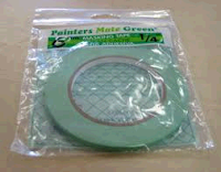
In particular, he used Painter's Mate Green, 1/4 in x 60 yds or 6 mm x 55 m. It looks like this photo at right:
The 6 mm width is just about the same width as a board marker and the best part is that you can erase over it and the lines are always there! The green is also more visible than standard yellow masking tape on a whiteboard. I have seen blue painter's tape too, but I could never find one thin enough to use. Check your local hardware store to see what you have available.
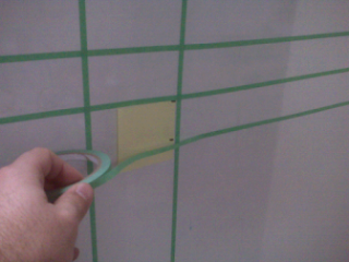
So the tools I used to make the last few Testing Dashboards are: (1) 6 mm painters tape, (2) a post-it note (for spacing), and (3) colour markers.
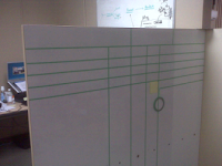
I start by marking the width of the whiteboard eraser on a post-it note, and then use the post-it note as a guide for making the lines across the board (see photos below). Follow the general table outline as shown in the presentation slides and you will get the general idea.


A finished board looked like this a few weeks later:
I highly recommend using different-coloured markers when you create and update the dashboard. It makes the different meanings really stand out - i.e. it enhances how you communicate the message. For example, when you write "BLOCKED" in big red letters and have a red unhappy smiley face next to some show-stopper bug report number, people notice.
Why use the LTTD? Why not?
A good reason to use a tool like this is that it helps you and your test team to communicate important information to the project team without them having to ask you every time. In one sense, it does some work for you. For example, project managers can check the dashboard if they want an update and they don't have to interrupt you while you are testing. I don't know many tools that add time to my day. I am happy to say that this is one of them.
If your role as a tester is to provide valuable information, then radiate information! Let everyone know how things are going about things that are important to them before they even ask! Is there other information that people care about? Add it to the board!
The dashboard displays important info at a high level - a level that everyone on the project should understand. I have seen it happen many times when someone asks a tester how things are going and the tester gets lost in the details of the latest problem or issue that he or she encountered. The Testing Dashboard helps pull the tester up out of the details to put such events in a different perspective. Is that latest issue a blocking issue, or just another bug? Is it a show-stopper, or something that you require additional assistance from someone else on the team to help you investigate? What impact does this issue have on the overall quality of this feature or this release? How far along are we in testing this feature or all the features at this point?
The answers to these questions are always immediately visible on the dashboard. While we are fascinated by the puzzles and challenges of the testing problems we face every day, it's nice to have a dashboard around to remind us how to communicate at a level that our customers need.
So why wouldn't you want to use a board like this?
This question is partly rhetorical. I can think of at least one good reason why you might not want to.
For example, if the security policies of your organisation prevent you from leaving information like this up in a visible location. While making information visible is kind of the whole point of this dashboard, if your organisation won't allow it then you may wish to investigate other options - maybe even high-tech solutions. You have a team of smart people working with you. Get together and brainstorm a solution that works for you.
There may be other conditions or times when this may not be the right tool for you. "Because it hasn't been done before" is not a good reason to avoid it. If you are looking to grow, if you are looking for new ways to provide more value in innovative, simple and effective ways, you should give this a try. What will your Testing Dashboard look like? What will it say?
Radiate!
Here ends Part 1, an introduction to the Low-Tech Testing Dashboard. In Part 2, I will delve deeper into some of the aspects of the dashboard - how we modified it in different projects, and how we integrated it with Session-Based Test Management.
Before I post Part 2, I am interested to hear what you think. Have you tried using a Testing Dashboard like this before? Did it work for you? Are you thinking about trying it? Any other concerns that I haven't addressed yet? Please leave a comment and let me know what you think.
Cheers! Paul.

Hi Paul,
ReplyDeleteWe tried to do a low tech dashboard in our company about a year back. We invested some time working out what we really wanted to radiate (as you put it) to other teams.
Our main trouble was the collation of these stats from every member in the test team each week to make an average. It was difficult to keep people doing it.
Looking at what you've did with your dashboard, I like it! It's simple and works, I think perhaps we started of with one to many stats.
I'll share this with my team it's a very good and helpful post.
Thanks for sharing.
Cheers,
Darren.
Thank you for the story and feedback, Darren.
ReplyDeleteI find the 'basic' dashboard stats (Effort, Coverage and Quality) are a good place to start. Whenever I begin a new project with a new client I always start there and build on it as required.
Build confidence and consistency with your team with these first and go from there. Please let me know if you do try it again. All the best!
Cheers. Paul.
Good post, Paul.
ReplyDeleteI'm intending to cover the low tech dashboard in my own blog very soon after posting part 1 last night.
I love the whiteboard idea. Simple, effective, and depending on where you place it, impossible to miss. Inspired thinking!
Cheers
Del.
Thanks Del,
ReplyDeleteYou should definitely write about your experiences. This is one topic that I haven't seen discussed very much.
Cheers! Paul.
Sounds a good approach and something I might be putting into practice soon. Now where is Part 2 ?
ReplyDelete:)